As part of my everyday routine, I pick up my smartphone to answer a call or write a text. I scan through the television menu to find something to watch. I get money from an ATM. And I surf the internet and pay bills online on my laptop. All of these things have one thing in common: a user interface.
A user interface is where man meets machine. It’s the point at which people interact with a machine to do something. And someone has to design that interface so that the user knows what the machine will do when the blue rectangle or the green circle is pressed. That’s where User Interface Designers like my employees Chase and Jonathan come in. The newest members of the CS Creative team, both work onsite at TI designing (you guessed it!) user interfaces.
I recently sat down with them both and asked about user interface design and if they had some tips and best practices for other designers. Here is what they had to say.
Jonathan: Use the lens of a first-time user.
As a designer it’s very easy to get into the mindset of, ‘”If I know how to do it, then everyone knows how to do it.” I think about how I would feel if I was given this software for the first time. I also think practically and consider not just first-time users, but users that aren’t technologically savvy.
Chase: Figure out the problem first, then be sure to solve the problem.
When a project gets started, it’s easy to get stuck in the minutiae or derailed by additional requests. Or worse: to try to cater to everyone. Then the solution becomes lost in a sea of add-ons, and may not solve the problem efficiently or effectively, if at all. Say I’m designing an email program. What if the program has a lot of bells and whistles or functionality, but isn’t the most intuitive at letting you check your email? At the end of the day, if all that the user wants is to check email, then that’s what the program should do—and do well.
Jonathan: Close the loop.
After the interface is designed, it can touch many hands and departments before the project is finished. By the time it’s done, it may not be what it was intended to be in the first place or function as originally designed. Reviewing a project once it’s nearly complete can help ensure the quality of the interface (or may lead to a trip back to the drawing board before it hits the market).
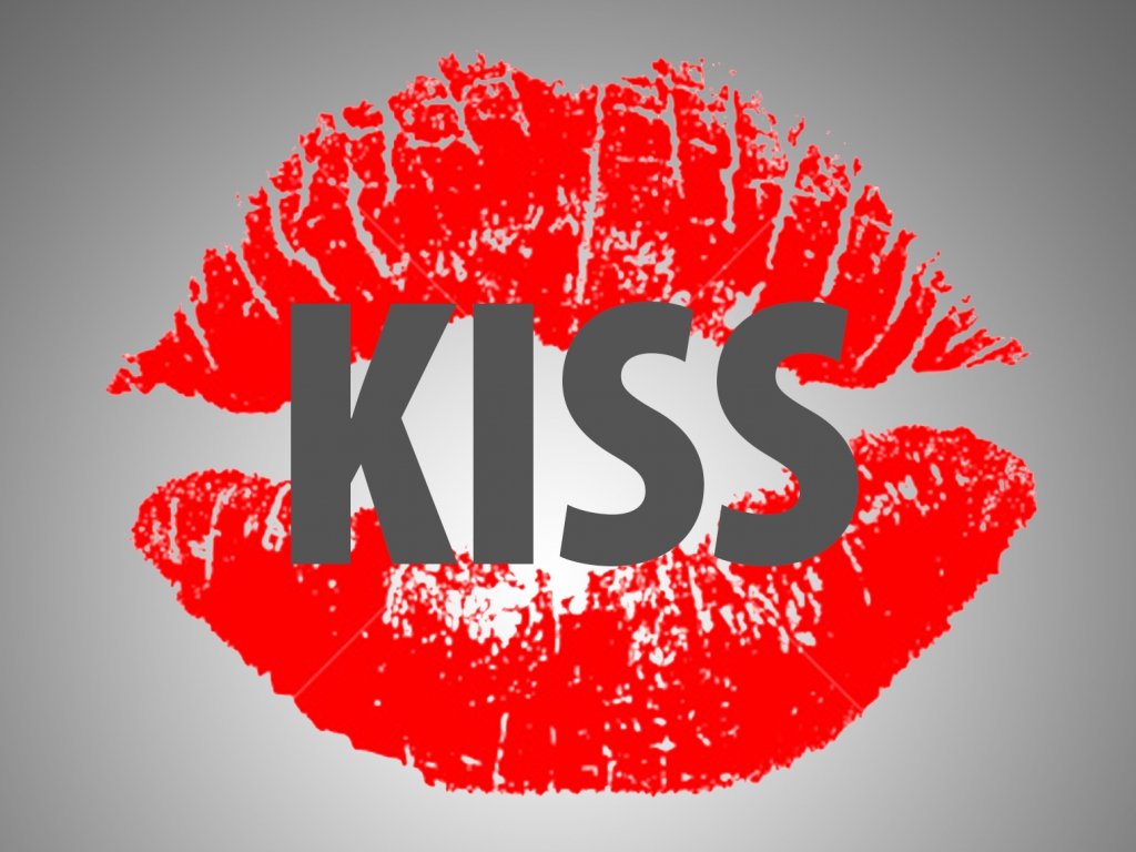
Chase: We all agree, it’s important to KISS – keep it simple stupid.
At the end of the day, people don’t read instructions. They just don’t. They just click things. By designing an interface that’s easily understood, it becomes intuitive for someone to use a device from the very first time it’s touched.
Jonathan: Make it engaging.
Just because a user interface is simple doesn’t mean that it’s plain or boring. I will sometimes use bold but complimentary colors to easily guide the user where to go next.
I had to smile to myself, because after hearing these points for designing user interfaces, I realized these were some of the same guidelines we’ve used in all other kinds of design over the years. Keep the audience in mind, solve the problem at hand, close the loop by referring back to the creative brief, create engaging design and keep things simple.